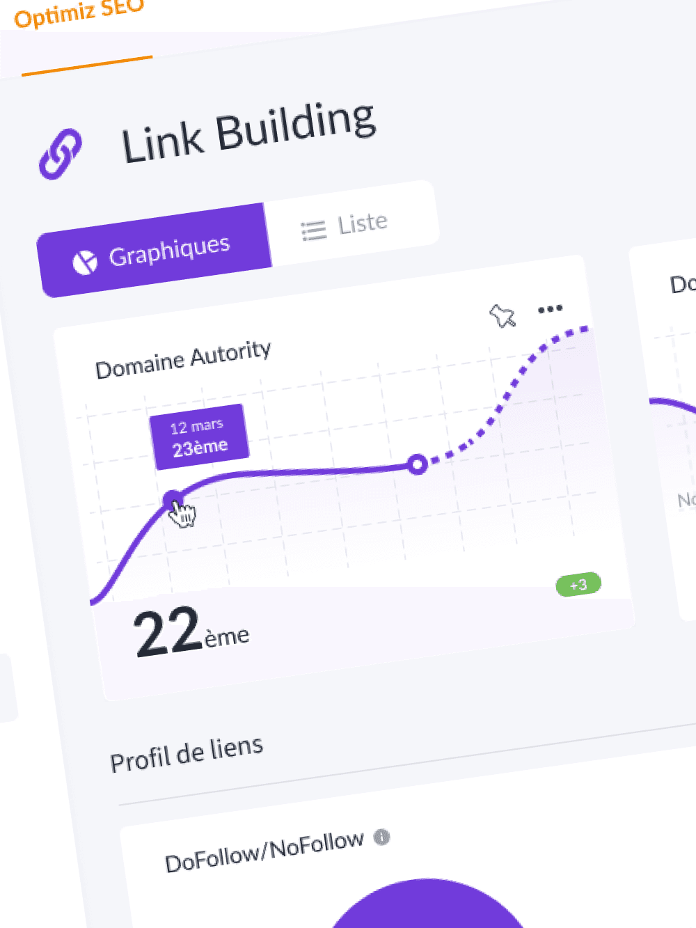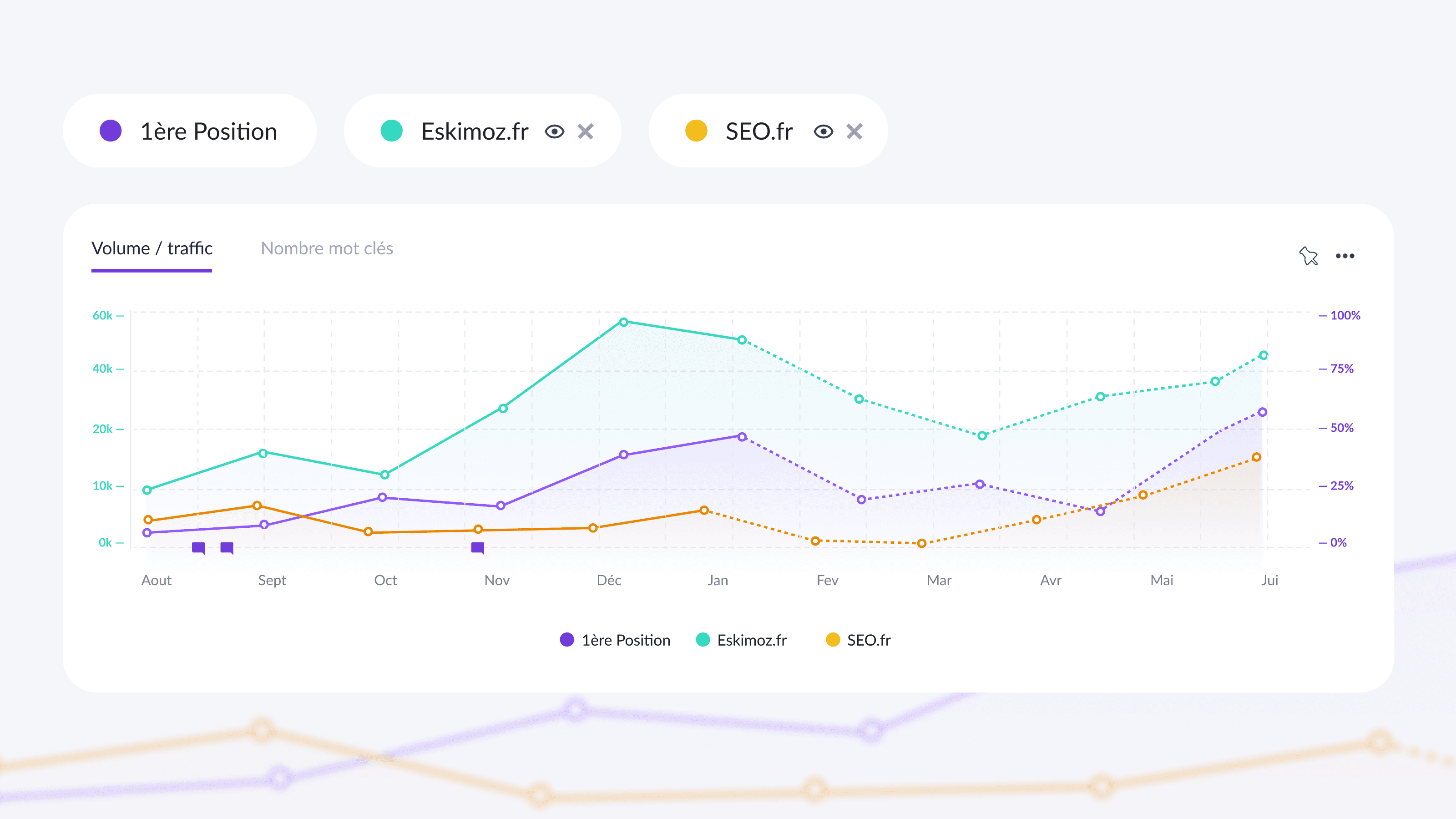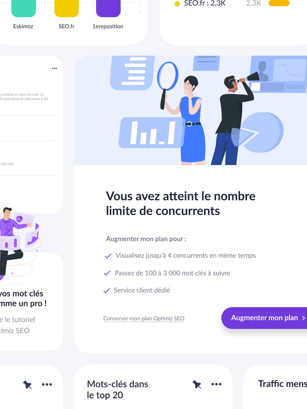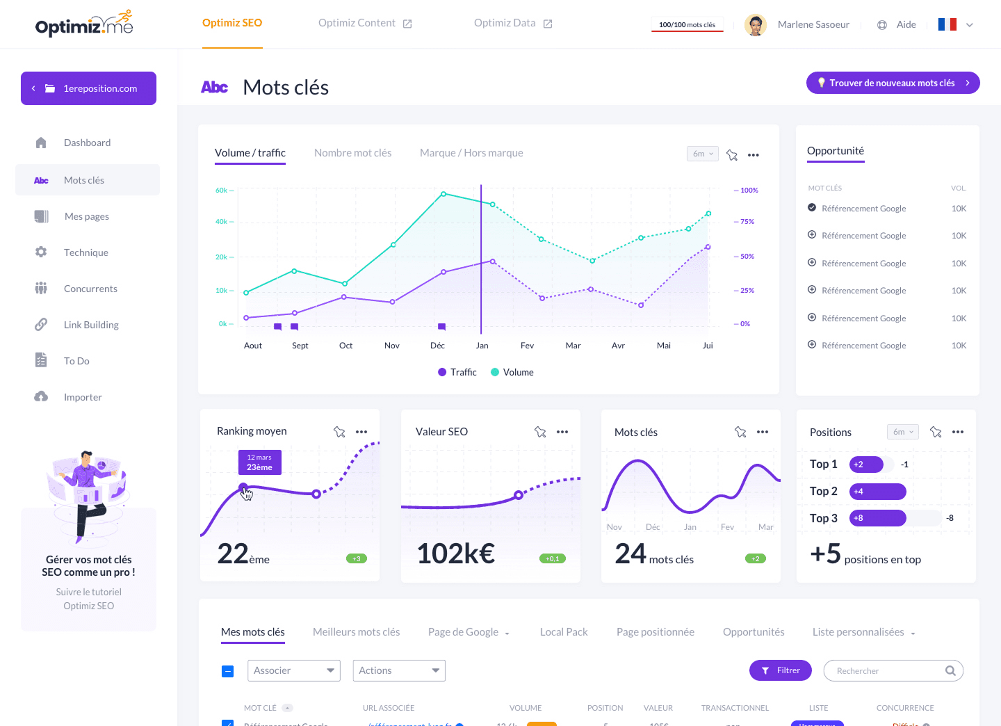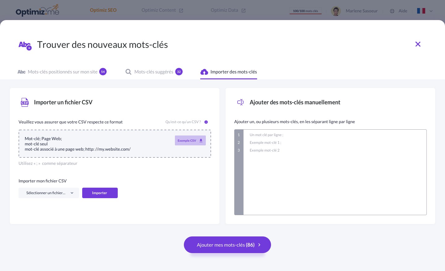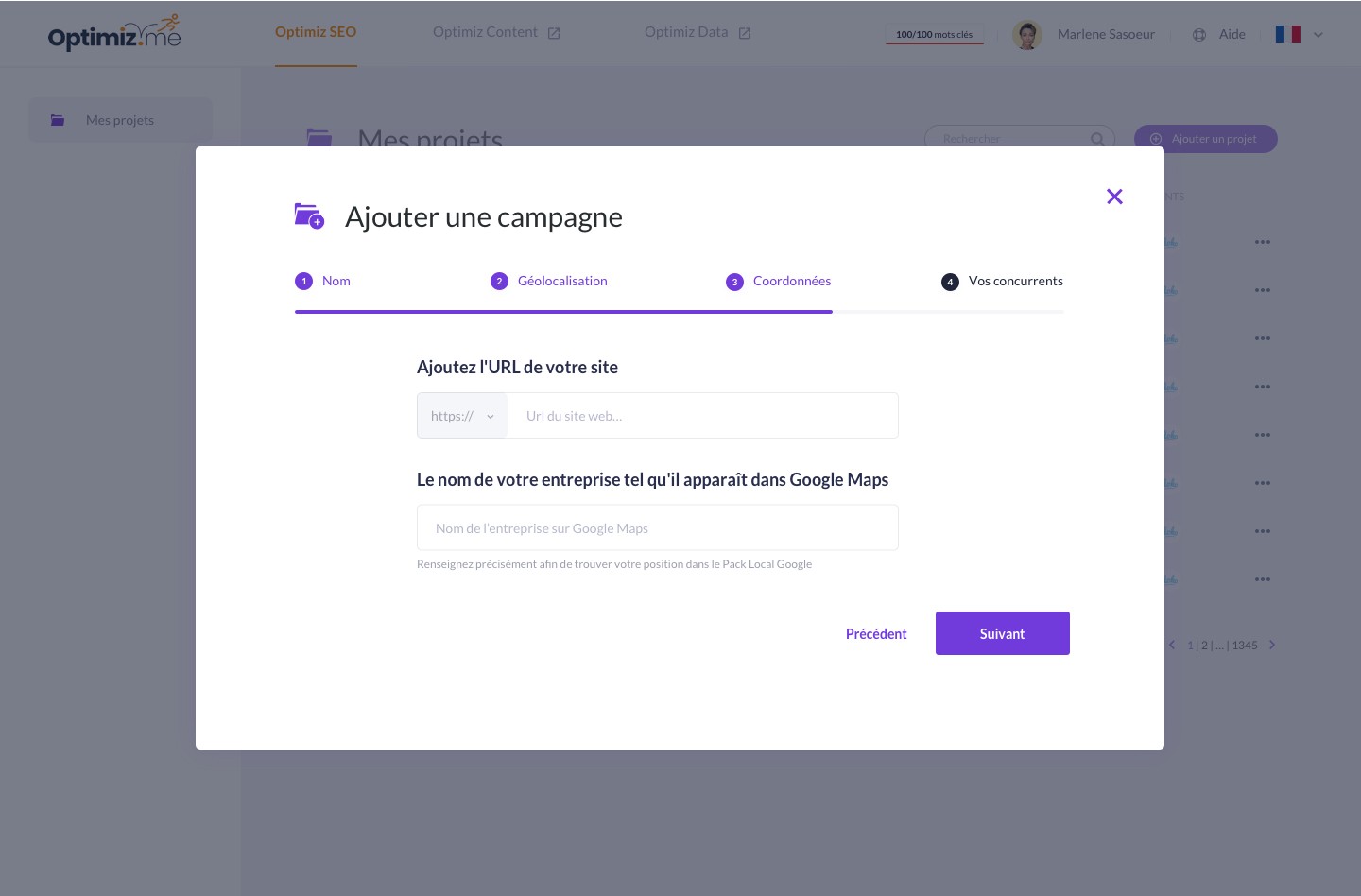
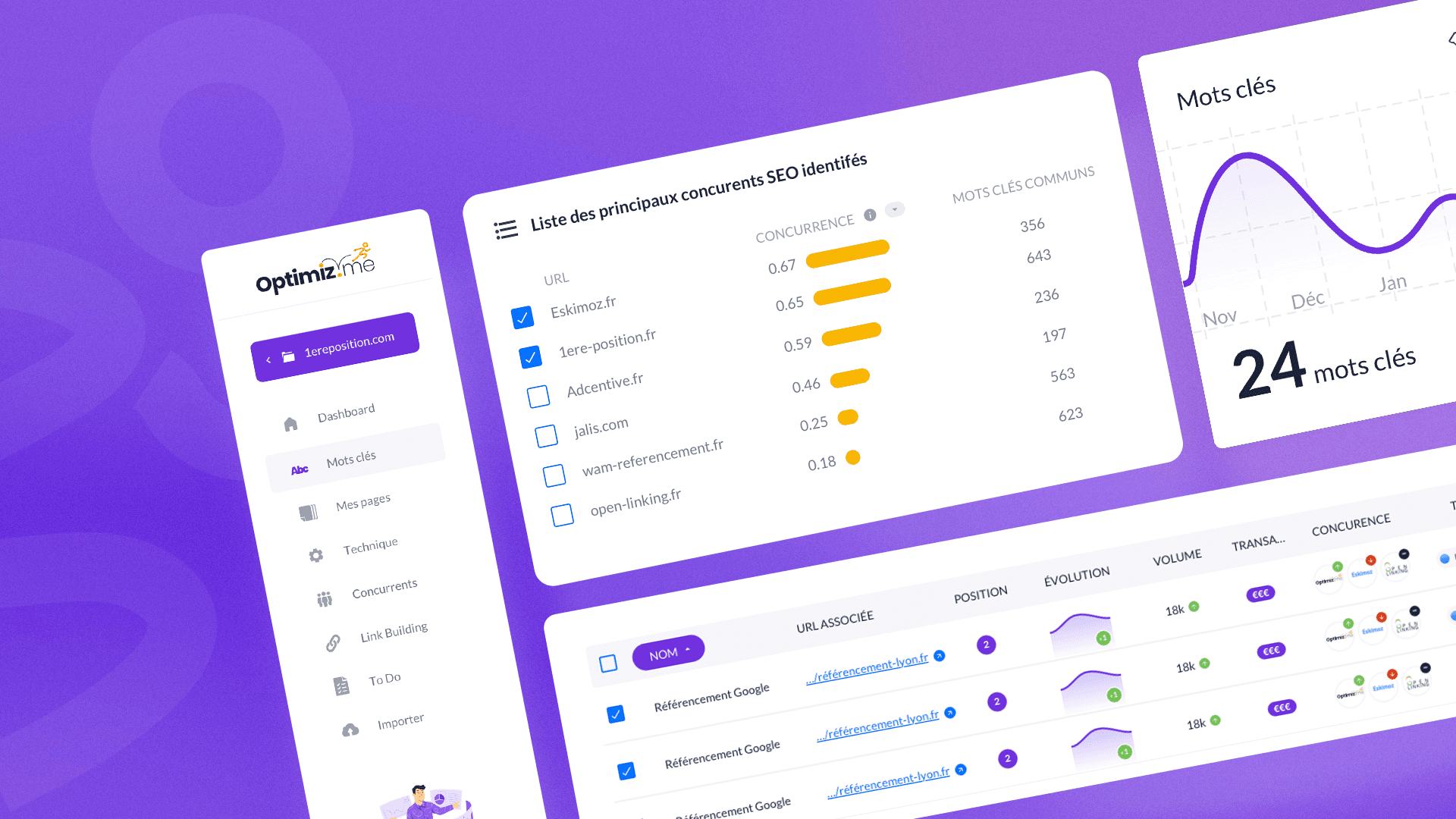
The design approach of this SEO keyword management software relies on a clear, structured, and performance-oriented ergonomics, crafted for professional users of organic search. The artistic direction focuses on a bright and modern palette, dominated by white and purple tones, which enhance both readability and the brand's visual identity. The overall design is punctuated by colorful touches (turquoise graphs, purple buttons, badges) that serve as visual cues to guide the user in their reading and actions. The design prioritizes a highly legible information hierarchy, with a clear separation between different data blocks, familiar pictograms, and a well-visible tab and filter system. The graphics of curves and indicators are both fine, sleek, and dynamic, illustrating traffic or ranking evolutions in an engaging way. The overall tone is educational yet professional, supported by gentle illustrations and accompanying messages to guide the user. The result is a functional, reassuring, and efficient interface that enhances data without overwhelming it, facilitating rapid decision-making in a business environment focused on SEO performance and results monitoring.